Student App: Connecting Students and Lecturers.
The Challenge
As students, we usually communicate with lecturers through messaging applications such as Whatsapp. However, there are times when lecturers do not reply to the messages from students. As a result of not replying to messages, a variety of new problems arise, which resulted in hampered student academic affairs.
Goal
I want to find a solution to solve communication problems between students and lecturers in the Department of Communication Sciences, Universitas Brawijaya.
My Role
In this case study, I do the design process from researching, designing the user interface, until create and testing the prototype.
I also collaborated with my friend Gayuh Karmantary who will conduct the UX writing part.
Design Process

#1. Empathize
User Interview
First of all, I want to find out if there are any students who have experienced difficulty in communicating with lecturers.
Then, I interviewed five final-year communication science students, to find out their experiences when communicating with lecturers.
From the results of the interview there are several important points that can be taken, namely:
- Some students often experience their messages are not replied to by their lecturers.
- Difficulty access to information related to lecturers, for example, information related to whether the lecturers can be met today or not, or today will teach in the classroom or not.
- Lecturers often leave information through a student to be distributed to other students. But in the end, not all students get that information.
- Students often wait for lecturers without clarity for hours, in order to meet or ask for the signature of a file, due to a lack of information updates from lecturers.
After hearing from the student, I also tried to understand why lecturers often do not reply to messages from students. And one day, I heard an explanation from the lecturers, the point of which is like this:
- Outside of teaching activities, lecturers are preoccupied with other activities such as research, meetings, and other academic activities. Hence, sometimes it is not possible for lecturers to check and reply to all incoming messages from students.
#2. Define
From interviews and lecturers' stories, I receive validation of my assumption that other students also often have difficulty communicating with lecturers.
Then I conclude some pain points that are the priority to be resolved.
Pain Points:
- Students have difficulty getting access to information related to lecturers.
- Students have difficulty making appointments with lecturers because sometimes lecturers are so busy that they do not have time to check all incoming messages.
- Lecturers do not have a platform to disseminate information directly to all students.
#3. Ideate
Sketching
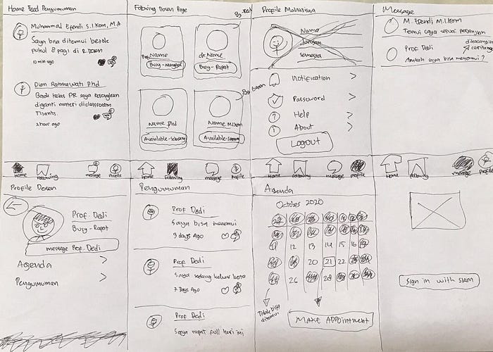
From these pain points, I tried to find ideas by drawing sketches on blank paper.
During the sketching process, I got the idea to create a feature such as a bulletin board as a medium for lecturers to update information every day, this is called “Home Feed Announcements”.
I also tried to create a system that aims to make it easier for students to make appointments with lecturers by creating a “Make Appointment” feature.
The “Make Appointment” feature serves as a medium to make appointments between students and lecturers, without having to go through messaging apps again.
Information Architecture
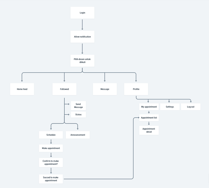
I have a goal to make this app simple enough that every student can use it without a hassle.
This app has 4 main sections (Home, Followed, Message, Profile). But in this study case, I give the most focus on the home & the followed section, because those two sections are the main feature of this app.
#4. Prototyping
Wireframing & Wireflow
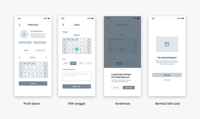
Then I continued by creating the wireframes and wireflow based on the sketch and information architecture.
The wireframes and wireflow were used to convey my ideas to others and also to gather early feedback from potential users.

UX Writing
After creating wireframe and wireflow, I proceed with the UX Writing process. For UX Writing I worked with Gayuh Karmantary who has experience as a UX Writer intern in Gojek.
We decide to use a casual tone of voice in the UX Writing process. Casual here means using an informal /casual style of language.
The reason is that the demographics of the user are students in the age range of 18–24 years.

Also, we choose to use Bahasa Indonesia because Bahasa Indonesia is used in the daily academic & social activities of the students.
After some discussion, we decide to change the name of the two main features, “Home Feed Announcement” to “Mading” and “Make Appointment” to “Bikin Janji”.
First Usability Testing
After the UX writing process was completed, I combined the results of UX writing done by Gayuh Karmantary with the wireframe that I had made.
Then I did the first usability testing using Maze Design with 5 participants consisting of final-year communication science students.
The goal of the first usability testing is to test the concept of the “Mading” and “Bikin Janji” features, does the two features can answer the problem that currently exists? Also is it the concept of “Mading” and “Bikin Janji” features are easy to use and easy to understand by the participant.
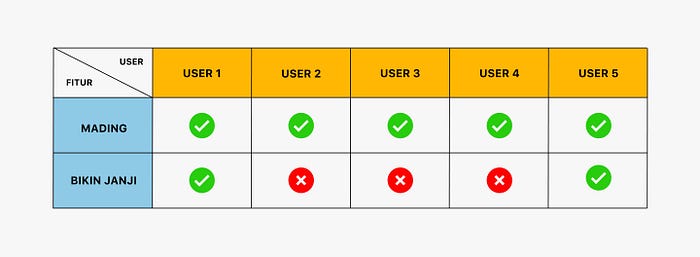
As a result of usability testing, there are three users who do not understand the “Bikin Janji” feature, but the rest completed tasks quickly with no issues/errors.
The three users who do not understand the “Bikin Janji” feature mentioned that they were confused because the visual of the app is unclear.
Apart from that feedback, all participants responded positively about the idea of “Mading” and “Bikin Janji” features.
UI Design
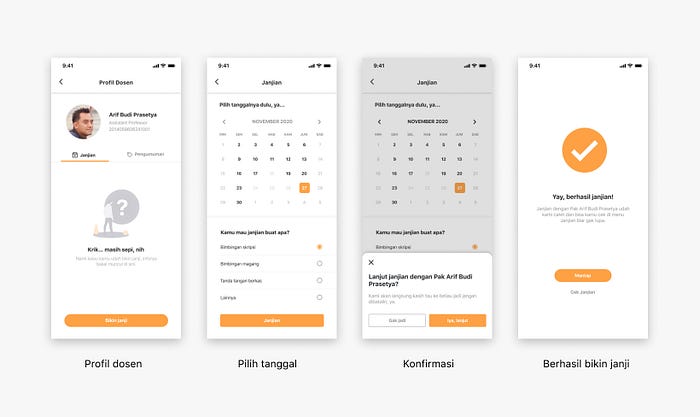
After doing the first usability testing, I continued the process of designing the UI using Figma.
For the UI design process in this application, here are the steps I did:
- First I sought design inspiration from various applications on the Mobbin Design site.
- Then I decided the main color is orange (#FEA144) because orange is the brand identity of the Faculty of Social and Political Sciences (FISIP) which houses the Department of Communication Sciences.
- For fonts, I chose to use SF UI Text, because the font is simple and has good readability.
- Then, I started the UI design process.
Result
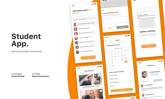
Solution #1: Mading Is Used as a Platform to Disseminate Information from Lecturers

- Pain points resolved: Students have difficulty getting information about the lecturers, and lecturers do not have a platform to convey information.
- “Mading” is useful as a medium of conveying information from lecturers to students related to academic activities.
- Lecturers no longer need to leave information to a student to be conveyed to other students.
- The idea is like sending a “tweet” containing an announcement for students.
Solution #2: Make An Appointment (Bikin Janji) with a Lecturer
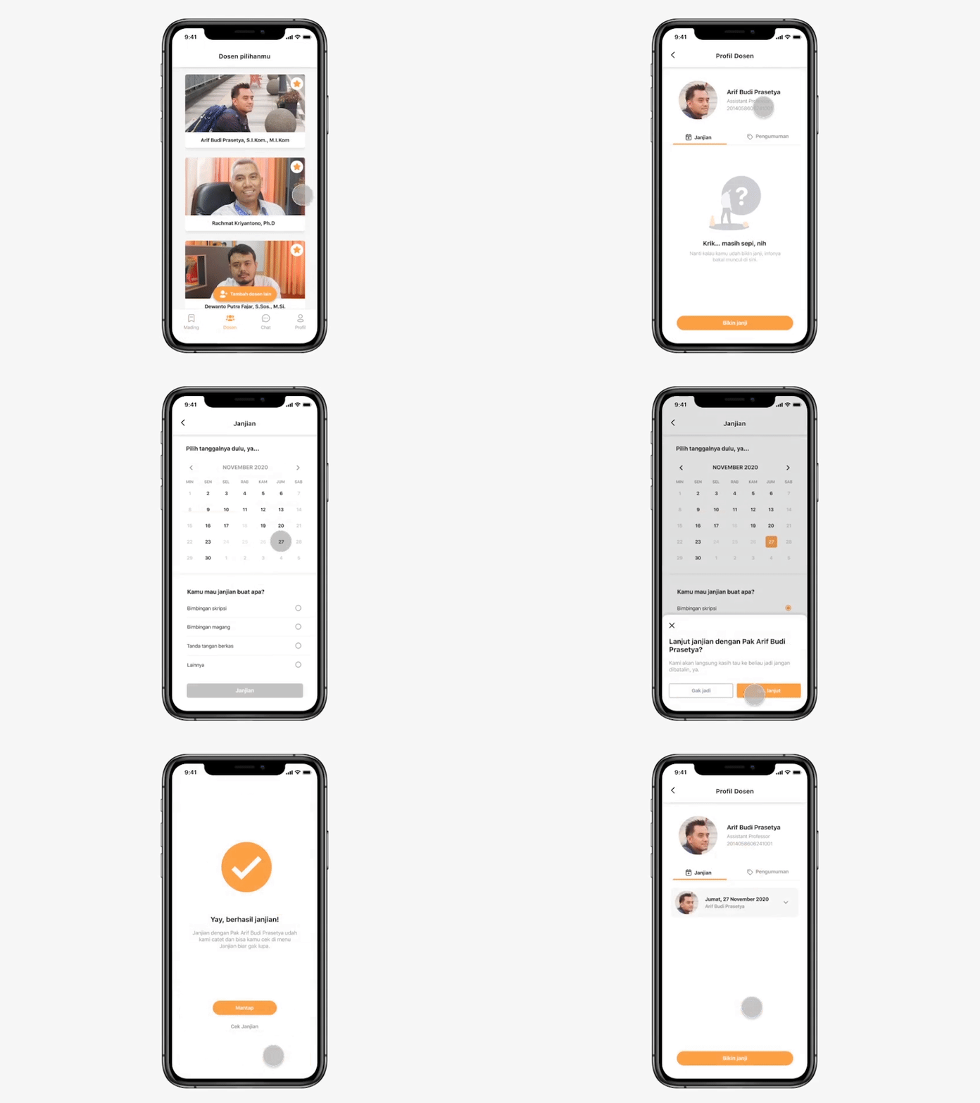
- Pain points resolved: Students have difficulty making appointments with lecturers.
- Lecturers can arrange which days and dates are available to meet students.
- Students can easily make an appointment with the lecturers according to the available date without having to go through chat and wait for the lecturers to reply.
- If the student apparently wants to cancel the appointment that has been made, there is a feature to cancel the appointment.
Second Usability Testing
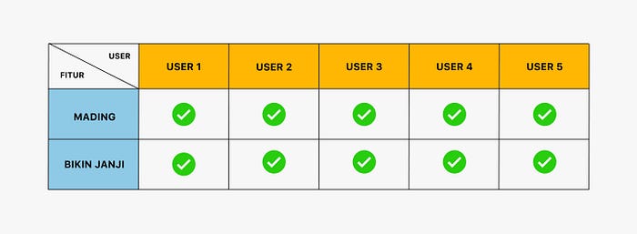
After the UI designing process is completed, the second usability testing is carried out while still using Maze Design, and with 5 final-year communication science students as participants.
The goal of the second usability test is to ensure the feature and the UI design can be understood by the user, and also to test if the features can answer the current problem.
As a result, all participants completed tasks with no issues/errors at the “Mading” and “Bikin Janji” features. Some users also leave positive feedback about the two features and the application.

“Very easy, existing features and tools are easy for students to understand. Hopefully with this application can make thesis guidance can be easier (unless the lecturers is really difficult to meet) huft, hopefully it won’t happen again.”
Clickable Prototype
To feel the full experience of the Student App, here I attach the clickable prototype below~
Conclusion
Student App was created as a communication platform for students and lecturers of Communication Sciences Universitas Brawijaya. The communication process that used to be only through chat applications now can become more effective through Student App.
I also hope that one day this Student App can be implemented in the Department of Communication Sciences, Universitas Brawijaya. So that it can provide a real impact as an effective communication platform for students and lecturers.
Also, I want to thank Gayuh Karmantary, who collaborated with me to create UX writing for this case study.
What I’ve got to do better
This case study is my first case study in designing an application so that many things still need to be improved and developed, such as:
- Find more variety of ideas and solutions during the ideation process.
- Increasing the number of samples/participants to validate problems and usability testing.
- Conduct more in-depth interviews with lecturers, in order to better understand the problems faced by lecturers.
Credit & Resource
Icons — coolicons & Iconly 2 (Figma Community)
Illustrations — unDraw.co
iOS 13 Design Kit — Juan Arreguin (Figma Community)
Lecturer Photo — Website Jurusan Ilmu Komunikasi
UX Writer — Gayuh Karmantary
Contact
Email — hello@mukiaji.com
Linkedin — Arman Mukiaji
